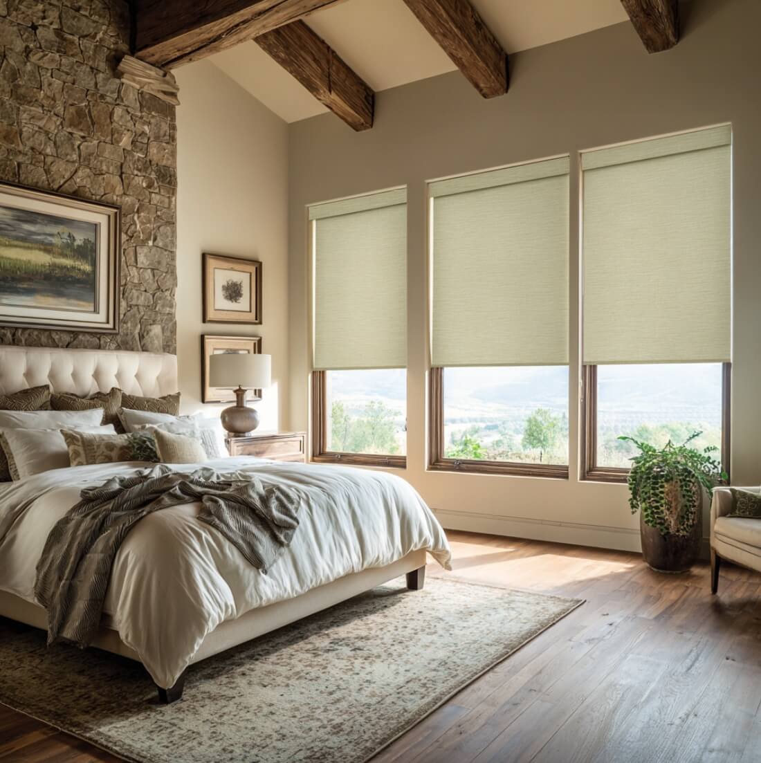
These shades maintain privacy while still allowing natural light to filter through softly.
This image is AI-generated and intended for inspirational purposes only; it may not be completely accurate.
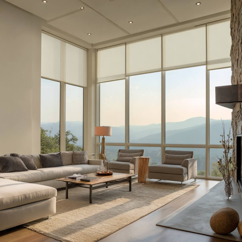
When starting your design journey, neutral wall colors provide the perfect canvas for window shades in Placentia, CA. Shades in beige, ivory, or soft gray blend seamlessly with neutral tones, creating a calm and balanced atmosphere. This pairing is ideal for homeowners who want understated elegance while keeping the room adaptable for other décor elements.
Creating Depth with Contrasts
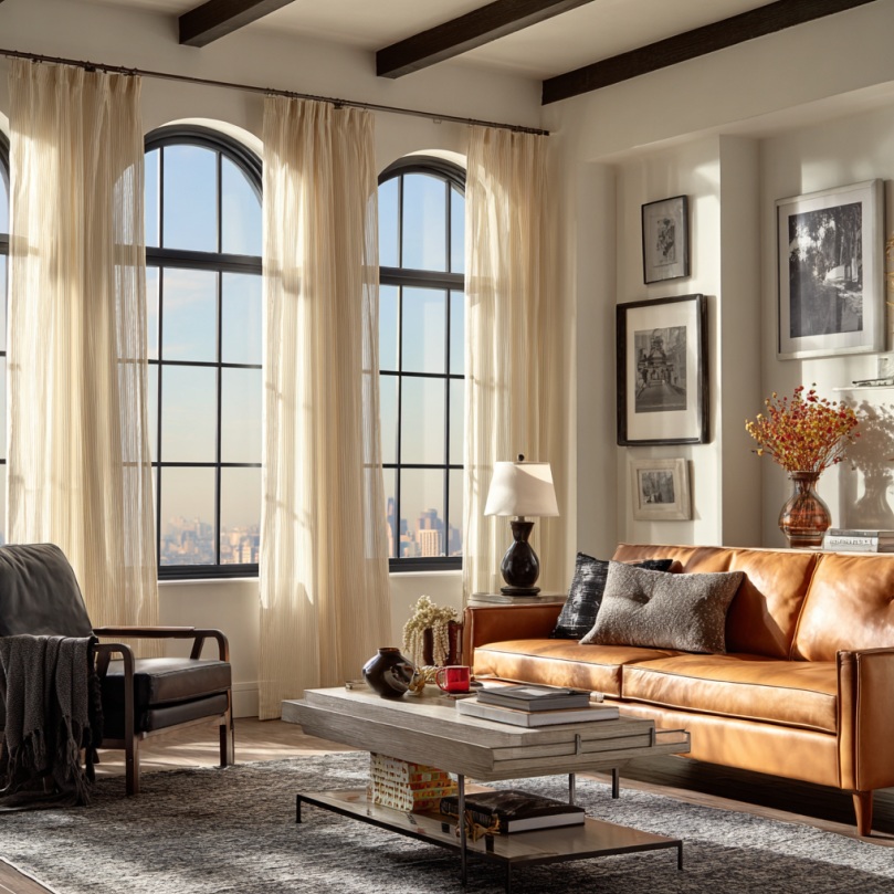
If you prefer bold statements, pairing light-colored walls with darker shades, or vice versa, adds instant drama to any room. A light gray wall can be beautifully enhanced with deep charcoal shades, while crisp white walls look sophisticated alongside navy or espresso-toned shades. This high-contrast approach introduces dimension and ensures the shades become a standout feature.
Harmonizing with Warm Hues
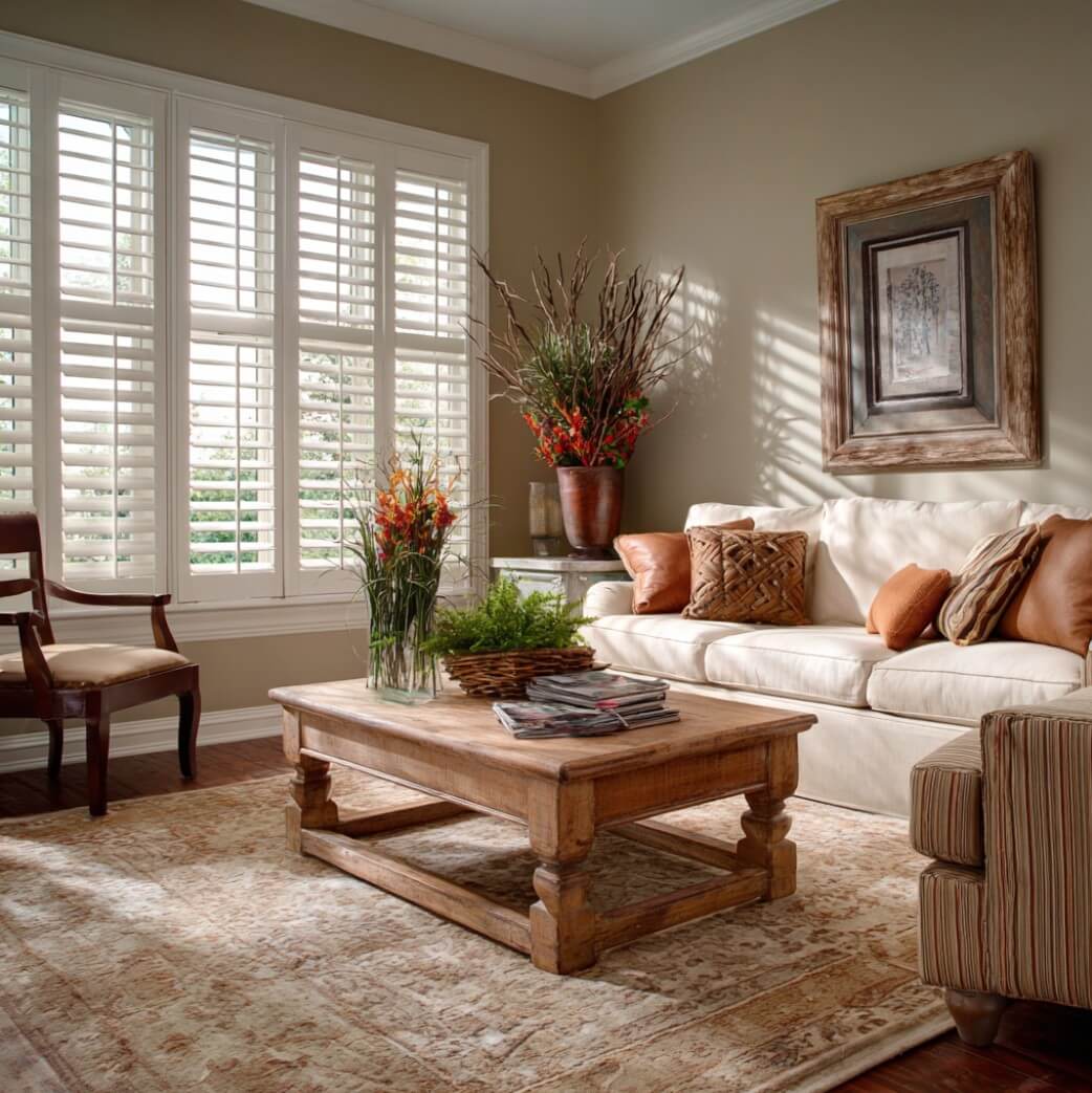
Warm wall colors such as terracotta, soft gold, or muted red can be complemented by shades in earthy browns or sandy tones. This creates a welcoming, cozy atmosphere while maintaining cohesion. Harmonizing with warm hues enhances the natural depth of the room, making it feel inviting and richly layered without overwhelming the design.
Cooling Down with Blues and Greens
For spaces painted in soothing blues, greens, or teals, coordinating with shades in crisp whites, light grays, or natural textures offers a refreshing effect. These combinations evoke tranquility and mimic the serene quality of coastal or nature-inspired settings. The right shades will amplify the calming mood of the space, ensuring a cohesive and relaxing environment.
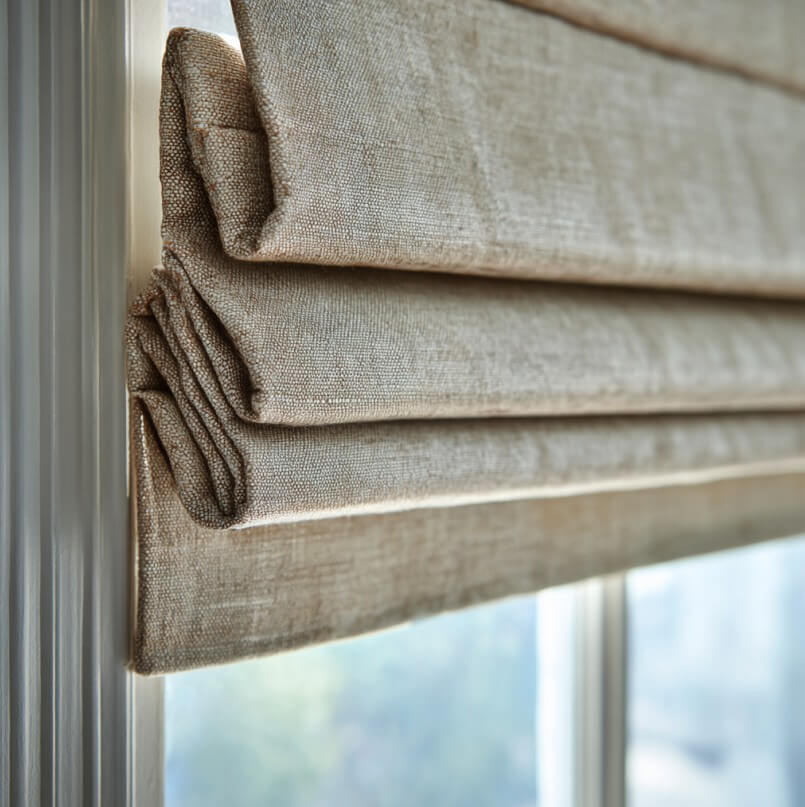
These are Roman shades, a style of fabric window covering that folds into pleats when raised. This image is AI-generated and intended for inspirational purposes only; it may not be completely accurate.
Soft Elegance with Pastels
Pastel-colored walls, such as blush pink, pale lavender, or mint, call for shades in subtle complementary tones. Choosing soft grays, muted whites, or even light patterned shades helps maintain a gentle and airy feel. This pairing avoids overpowering delicate wall colors while enhancing the room’s charm with understated sophistication.
Bold Harmony with Jewel Tones
When working with jewel-toned walls like emerald green, sapphire blue, or amethyst, opt for shades that match their richness. Deep, velvety shades in coordinating tones or neutrals with subtle texture bring balance to the vibrancy of jewel walls. This combination adds refinement and ensures both elements shine equally.
Natural Textures for a Balanced Look
Incorporating natural textures like bamboo, linen, or woven fabric shades is an excellent way to harmonize with a variety of wall colors. These materials work exceptionally well with earthy palettes and soft neutrals. They not only add warmth and depth but also introduce an organic touch, making the space feel timeless and connected to nature.
Coordinating Across Rooms for Flow
Beyond a single room, consider how shades and wall colors coordinate throughout your home. Using complementary palettes across rooms creates visual flow, preventing abrupt design changes. Whether through repeated tones or subtle shifts in color intensity, this thoughtful approach ensures consistency and harmony throughout the living space.
Elevating Design with Color Harmony
Coordinating shades with wall colors requires a careful balance of contrast, harmony, and texture to achieve timeless results. The enduring appeal of window shades in Placentia, CA comes from their ability to enhance any room with both style and function. Elevate your interiors with stylish shade and wall color pairings that never go out of style. Know more about our service at White’s Draperies and More.